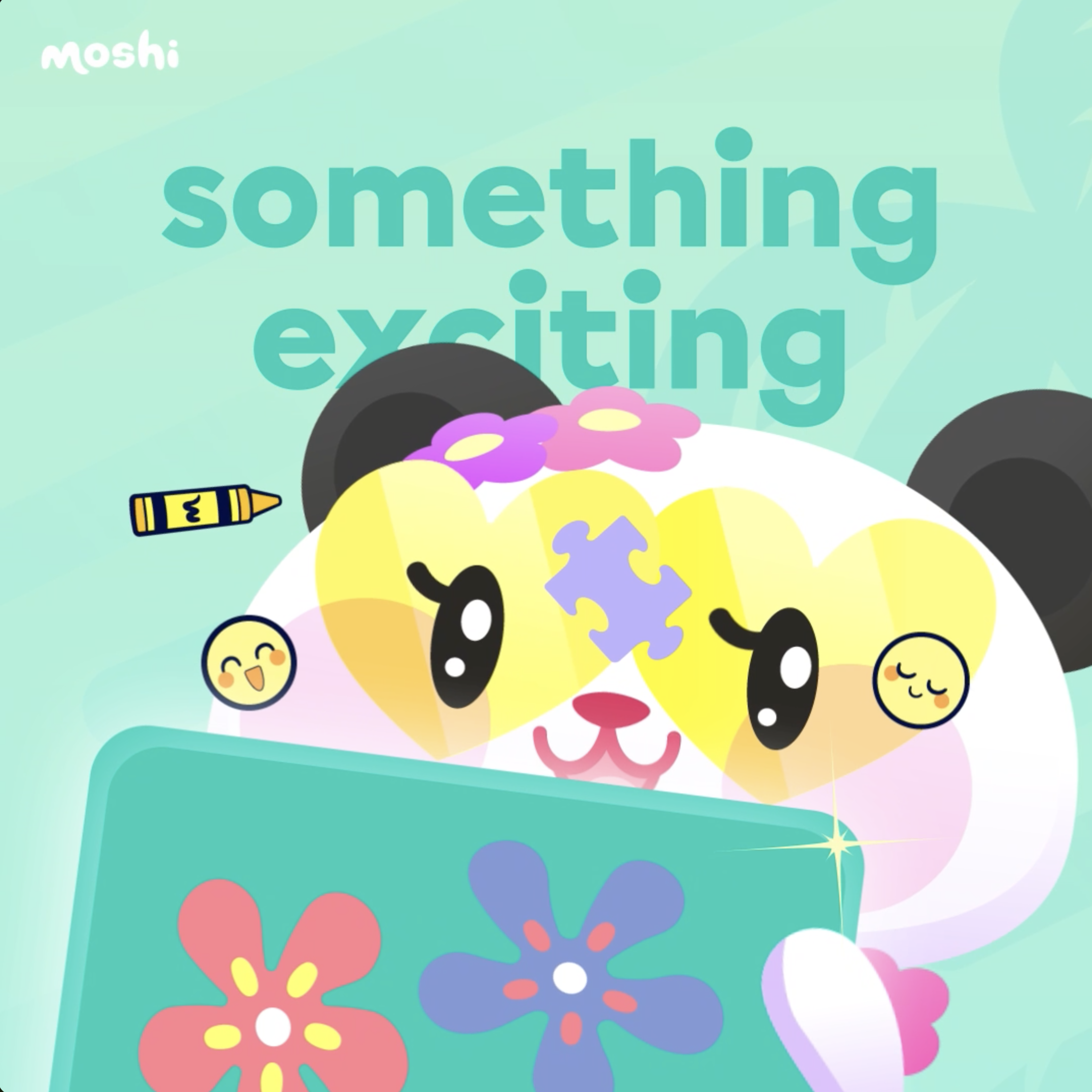
Since moving into the kids' gaming space in January of 2023, Moshi's brand needed to evolve to promote more of the fun and engaging characters in the Moshi world. As part of this process, I created a system to guide our design team forward as we promoted not only the Moshi PLAY games, but strategically updated the visual brand direction for easy scaling and sustainability. The challenge is how to update Moshi's templates while still making use of the existing doodle elements and expanisive artwork library.
After some comp set research and understanding the goal of the rebrand per the CEO and Product design team, I dove into playing around with possible directions and mockups in Adobe Illustrator, Figma and After Effects to translate PLAY across the updated visual direction of the Moshi Kids brand. I played with gentle gradients, tone-on-tone color combinations, and pulled PLAY symbols and illustrated features out of their original vector-illustrated stories to make graphics come to life. I also proposed saving the "Coral" brand color for moments when Moshi asks customers to action, like button graphics.
The updated Moshi visuals make more room for added PLAY games in the future and help smooth a more cohesive across the board.
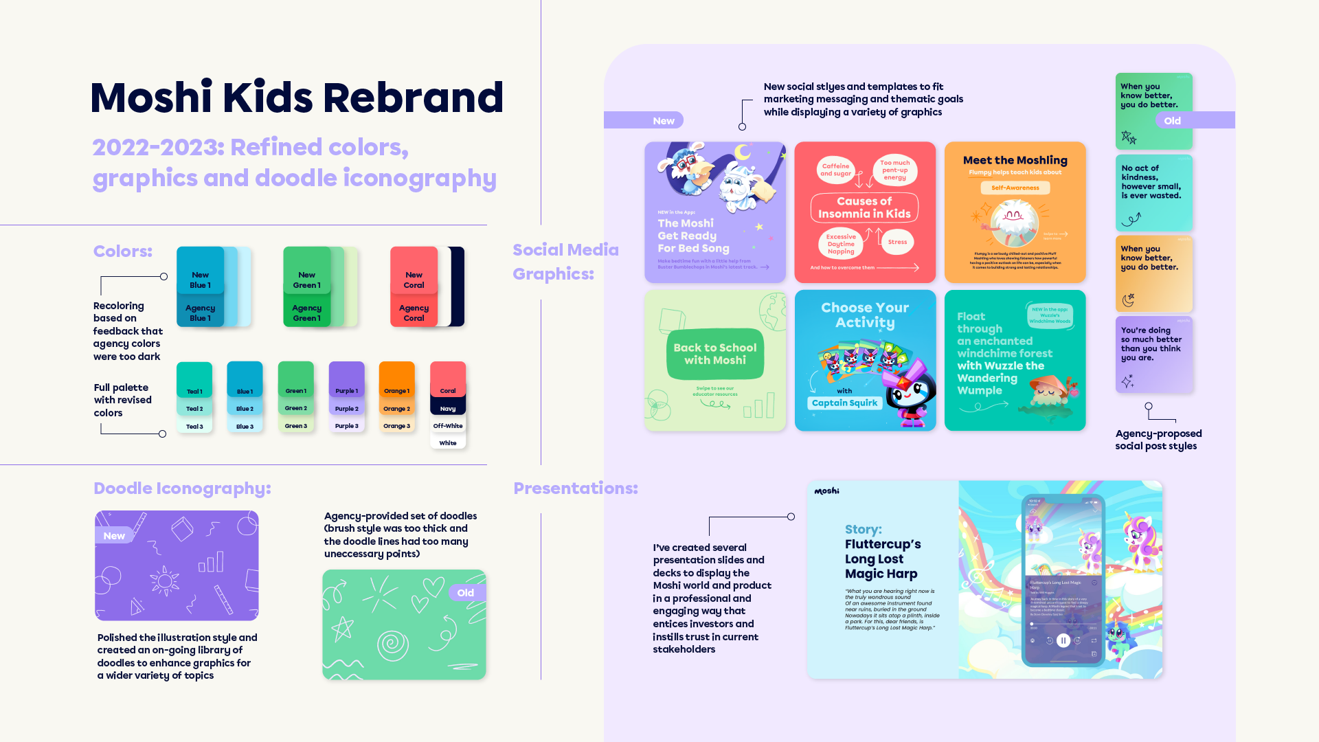
Here is the old brand and the agency rebrand from 2019:

Here is the rebrand I worked to create starting in 2022 and through the Moshi PLAY launch in 2023:
For the new app store banner, I used the cooler brand colors in the background to emulate the calming effect that Moshi's games have on children. I pulled fun and cheerful elements from the game vector files, like the smiley faces, puzzle pieces, and confetti to add pops of joy and visual interest throughout the graphic, but without overcrowding the screen mockups. I also started

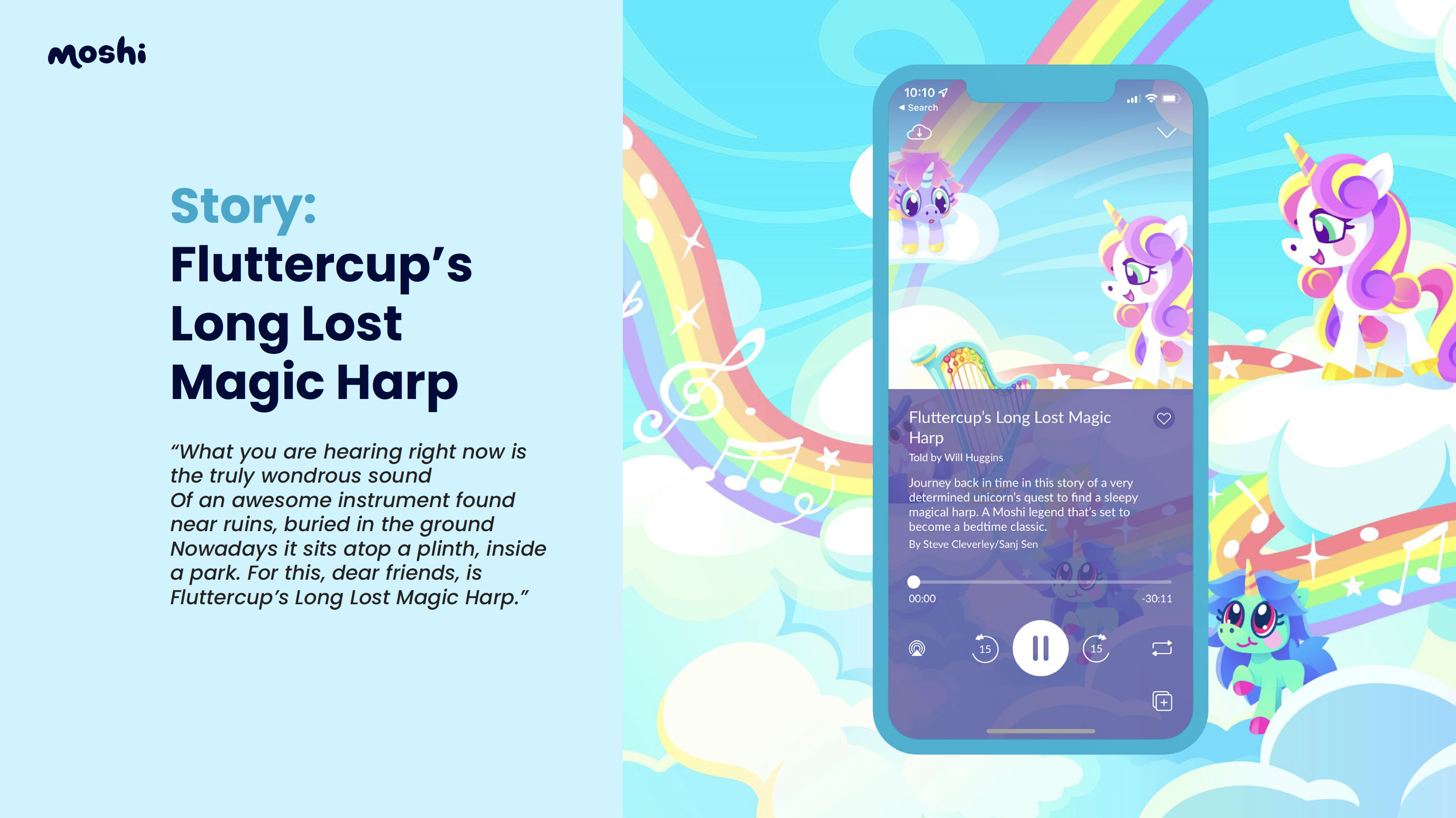
For deck designs, I landed on clean, legible layouts that follow brand guidelines while making track artwork pop.

For new game emails, I created a template that focuses on the characters involved in the game and used pieces from the games as visual accents. Dedicating a tone-on-tone color variation to a speicific email helped differentiate emails for users.


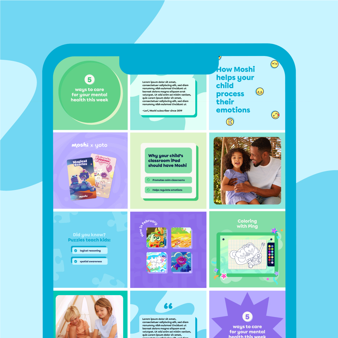
For the social templates, my junior designer and I each came up with a few mockups and met to walk each other through our designs. From there I spent some time combining ideas from our respective templates into a new Adobe Illustrator document and polishing the designs to create a cohesive and easy-to-use look. I also introduced more confetti and game symbols to highlight the characters' games and stories. These static ideas were built in Adobe Illustrator and rebuilt for easy use and scaling in Figma. I sketch storyboard animations and movement flows with a pen and paper before bringing them into After Effects.

For music app (Spotify Track Covers and Best of Amazon music) templates, I continued to experiment with pulling a mix of subtle and relevant elements from a track's Adobe Illustrator file to give the graphics more depth and context, while still maintaining a simple and soothing feel. Since I'm able to pull directly from Illustrator into Figma, this process was quick to test and easy to replicate. It's also easy to export and scale across other sizes, as needed. Therefore, I was able to create sustainable templates that are still used today.


